
Overview
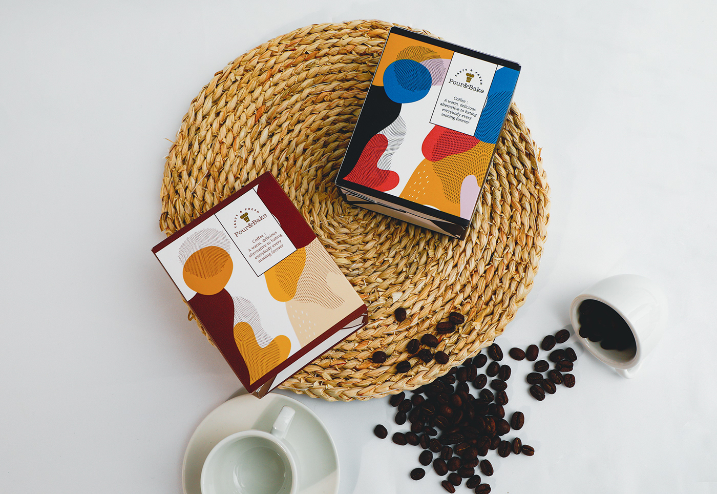
The coffee cup takes center stage with its distinct design that seems to leap out at the viewer. The use of vibrant, contrasting colors with abstract patterns gives it a modern and appealing aesthetic. This kind of design is trendy, suggesting that the brand, "Pour&Bake," targets a young, hip audience that appreciates a fusion of contemporary art and everyday items.
The phrase on the cup, "Coffee: A warm, delicious alternative to hating everybody every morning forever," injects humor and personality into the design. This suggests that the brand not only values the quality of their product but also understands the cultural nuances of coffee drinking as a widely-acknowledged morning ritual.

The cup uses a playful mix of pastel and deep tones, with shades of blue, pink, orange, and purple. This creates a sense of warmth and friendliness.The choice of colors may also be psychological; blues are often associated with reliability, pinks with warmth and care, and purples with creativity and luxury.The abstract shapes are fluid, with no defined edges, which can be interpreted as a metaphor for the fluidity of coffee. The halftone dots give a nod to retro printing processes, perhaps alluding to a blend of the old and new, much like how coffee traditions span centuries. The font used for "Pour&Bake" is simple and modern, with a sans-serif typeface that's easily readable, which is practical for branding purposes. The humorous tagline is presented in a smaller font, inviting those who look closer to engage with the brand on a more personal level.
The matte finish of the cup suggests a quality product. It's not reflective or glossy, which can be more comfortable to hold and visually pleasing. The texture of the donuts is well-captured, highlighting the glaze and toppings, which can almost be felt visually.
The lighting in the photograph is soft and diffused, giving the scene a calm and inviting atmosphere. There's a homely quality to the setting that suggests comfort, reinforced by the presence of the candy pieces scattered casually around, adding to the laid-back feel.

In conclusion, the design elements of the "Pour&Bake" coffee cup harmonize to create a product that's not only visually appealing but also imbued with character. The branding successfully conveys quality, modernity, and a touch of humor, which can resonate well with a contemporary audience that values both style and substance in their coffee experience.


